
- Note: A detailed version of this tutorial can be download as a PDF from here . Following is a web version of the CRAPome tutorial.
- Introduction
-
This tutorial describes the REPRINT (Resource for Evaluation of Protein Interaction Network). It comprises of (A) the current version of the contaminant repository for affinity purification mass spectrometry data (CRAPome V2.0) and (B) an integrated pipeline to analyze user generated APMS data. This pipeline is an extension of the CRAPome “user data analysis” workflow with several new features including i) additional scoring functions, ii) tools to visualize scored interactions and iii) an advanced network generation and analysis tool.
A. The contaminant repository contains the lists of proteins identified from negative control experiments collected using affinity purification followed by mass spectrometry (AP-MS). Original MS data for each experiment are obtained from the data creator(s), generally as .raw or mzXML/mzML files (mgf files are also accepted if raw/mzXML data cannot be obtained for any reason). MS/MS data are processed by the repository administrator using a uniform data analysis pipeline consisting of an X!Tandem database search against the UniProt protein sequence database, followed by PeptideProphet and ProteinProphet analysis (part of the Trans-Proteomic Pipeline). Each experiment in the CRAPome represents a biological replicate (technical replicates, i.e. repeated LC-MS/MS runs on the same affinity purified sample, or multiple fractions as in the case of 1D SDS-PAGE separation, are combined into a single protein list). Protein identifications are mapped to genes (see FAQ at the end of this document) and stored in a database along with their abundance information (spectral counts). CRAPome controls are associated with an experimental description via text-based protocols and controlled vocabularies. Users query the database using different user workflows (described below).
- CRAPome welcome screen
-
The users of the repository access information stored in the database by first selecting one of the three workflows shown in Fig. 1, and described in detail below. A number of additional options are available from the menu bar; visible options depend on user status (e.g. end user, data contributor/annotator, admin).
-
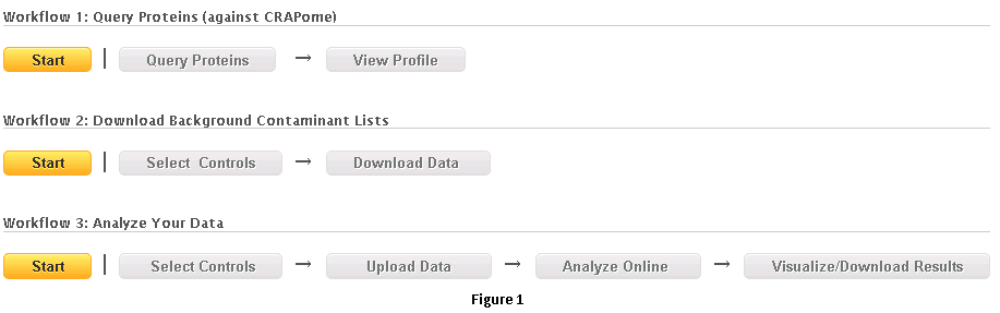
- Workflow 1: Query selected proteins
- This workflow allows the user to query for selected protein(s) of interest and view their profiles across different negative control experiments.
-
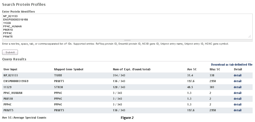
Step 1: Select the appropriate dataset (Fig. 2).
-
Step 2: Paste a list of protein(s) or gene entries in a tab, comma or new-line separated format and click on ‘submit’ as shown in Fig. 2 . RefSeq protein ID, Ensembl protein ID, NCBI Gene ID, Uniprot entry name, Uniprot entry ID, HGNC gene symbol can be used to query the database. Examples of compatible formats are also shown in the figure.
-
Step 3: The query returns a table of results ( as seen in figure 2, below the query box). The first column of the table shows the list of entries submitted by the user, while the second column lists the Gene Symbols mapped to the entries. The third column details the number of experiments in the database where the selected gene/protein was detected (with at least one peptide having PeptideProphet probability of 0.9 or higher); the total number of experiments in the CRAPome is also listed. The fourth and fifth columns list the averaged spectral counts and maximal spectral counts for the selected gene/protein across the experiments in which it was identified. The last column provides a link to the detailed profile for each of the selected genes/proteins.
-
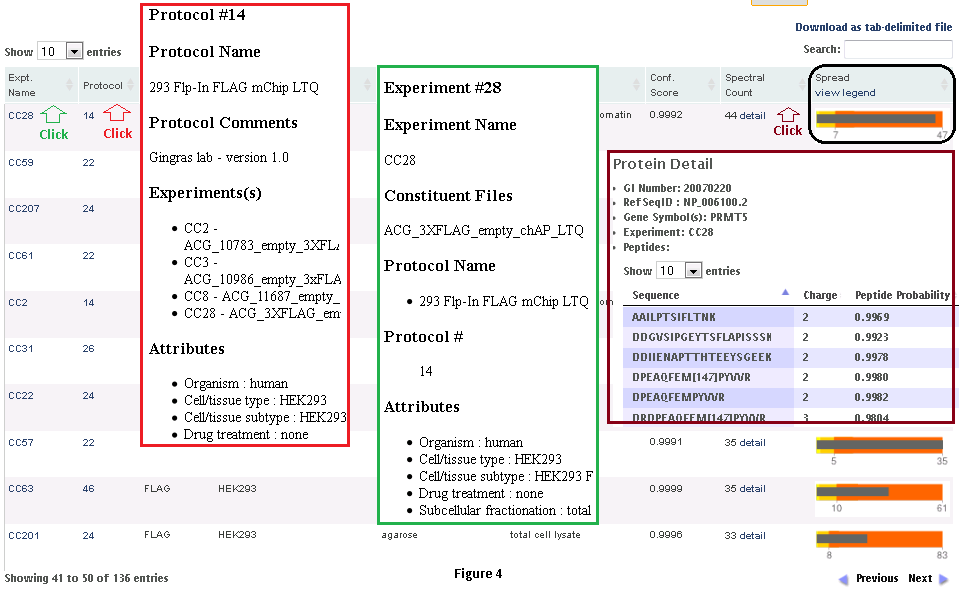
Step 3: When the user clicks on the ‘detail’ link, a profile of the protein (in the CRAPome repository) is shown, as in Fig. 3. At the top of the page are graphical summary views of the data. The profile on the left shows the abundance distribution across experiments (i.e., how many CRAPome controls report this protein in the spectral count ranges 1-2, 3-5, 5-15, and so on; Fig. 3.3, left panel). If there are many experiments that report a protein in the higher spectral count ranges, one can suspect that it has a greater propensity to be a contaminant. Also shown (on the right) are the frequency of identification across groups of experiments selected based on the controlled vocabularies used to organize the data. This figure helps to provide an overview of (experimental) conditions in which this protein is likely to be a background contaminant. The actual identifications of the protein in each experiment in the CRAPome repository (along with the identification scores and spectral counts) are listed below the figures in a tabular format. The protein abundance distribution for each control (with protein abundances measured by their spectral counts) is also shown in a small box plot-like figure. The grey bar represents the spectral counts for the protein of interest. The background bands, from light yellow to dark orange colors, represent the 1st, 2nd, 3rd and 4th quartiles, respectively. When the grey bar representing the protein spectral counts is in the dark orange area, this protein is amongst the most abundant proteins in the corresponding CRAPome control.
-
-

-
- Workflow 2: Create contaminant lists
-
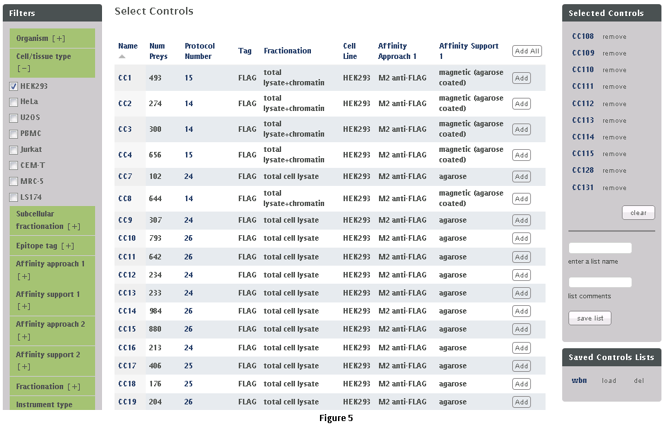
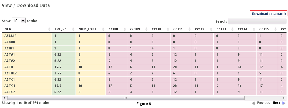
This workflow allows the user to download subsets of data from the CRAPome repository. Each control experiment (CRAPome Control, or CC) is assigned a unique identifier (CC1-CCx), linked to a protocol, and annotated with standard vocabulary (such as the epitope tag type, cell line, affinity matrix, etc.). These attributes can be used to filter the list of available CRAPome controls. These filters are available on the left as shown in Fig. 5.Step 1: Use the filters on the left (Fig. 5) to narrow down the list of negative controls.Step 2: “Add” each desired CRAPome control of interest by clicking the button in the table. If desired, select the “Add All” button instead. Added controls will appear in the “Selected controls” box on the right. There is a limit of 30 controls that can be selected at the same time. A link at the top of the home page provides an option to download the entire database content as a tab-delimited text.Step 3 (optional): Give this list of selected controls a name and save it for future use (note that this option is restricted to registered users). If you wish to reload a previously saved list, you can do so by clicking the “load” link.Step 4: Click on “Next” button at the top of the page to view and/or download the data matrix (Fig. 6). The file will be downloaded as an Excel compatible table.Step 5 (optional): Specific proteins can be queried in the data matrix by typing partial or complete gene name (wild cards are automatically added at the beginning and end). The data matrix can be downloaded as a tab delimited file using the “download data matrix” option.
- Workflow 3: Use the CRAPome to analyze your data.
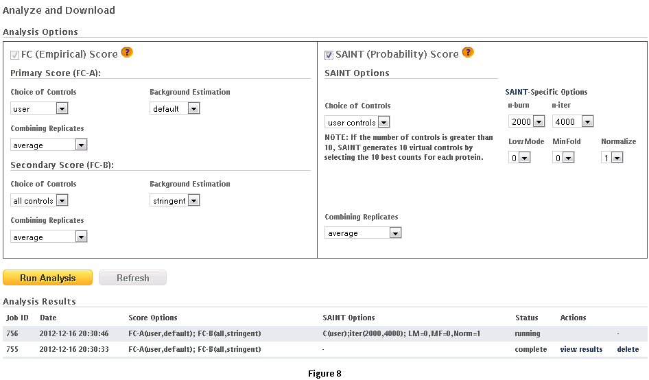
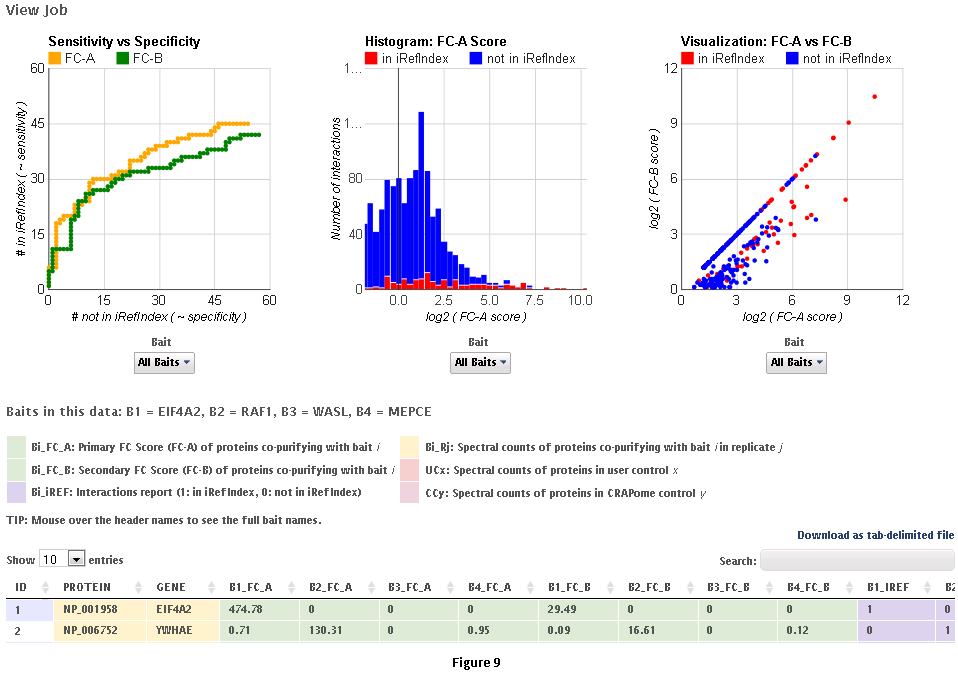
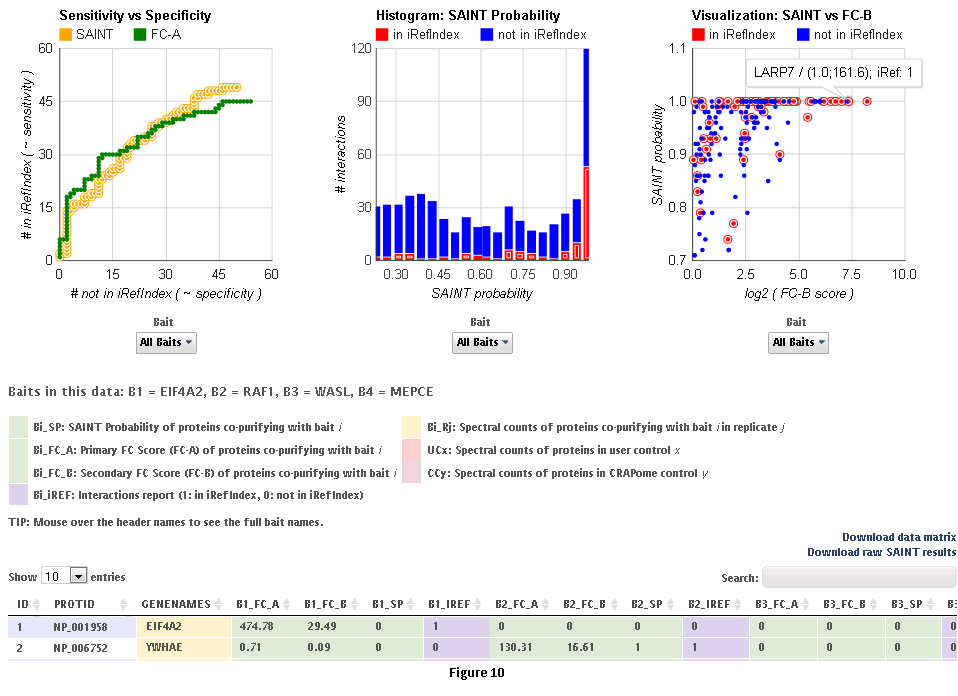
This workflow allows the user to process his/her data online using the CRAPome controls and the scoring tools implemented within the system. This workflow is only available to registered users. The minimum requirement is for the user to submit information regarding one bait (one sample), though we strongly advocate the use of biological replicates for the bait, and recommend that the user also uploads his/her own negative control runs.Step 1: Select the CRAPome database controls that are most similar to the user data using controlled vocabularies and detailed protocols as shown for workflow 2 above (see Fig. 5). Selected controls can be saved as a list and reloaded as needed as in workflow 2. Press the blue “Next” button to navigate to the next page.Step 2: Upload user data (See Fig. 7). The data should be formatted as per instructions on the webpage (also see Fig. 7). Once uploaded, the data appear in the ‘user data’ section below.Step 3 (optional): If the user would like to exclude some of his/her data from the analysis, it can be done at this stage by clicking on ‘remove’ button. Similarly, one can go back and add/remove CRAPome controls. For a quick preview of the data matrix, click on ‘Preview Data Matrix’. After the analysis is complete, the data can be deleted by clicking on ‘clear uploaded user data’ (See Fig. 7).Step 4: Proceed to the analysis section by clicking on ‘Next’. Here, Fold Change calculations and SAINT probability scoring can be used to generate ranked lists of bait-prey interactions.Step 5: Select desired scoring options for Fold Change calculations (Fig. 8). Two different Fold Change calculations are generated by default. The first one (FC-A; standard) estimates the background by averaging the spectral counts across the selected controls while the second one (FC-B; stringent) estimates the background by combining the top 3 values for each prey. Combining scores from biological replicates of a bait purification is performed in FC-A by a simple averaging, while FC-B performs a more stringent geometric mean calculation. These parameters are preselected by default, but may be modified by the user as required. The user can also specify what set of controls to use (user controls alone or in combination with selected CRAPome controls). A more detailed explanation of the score is availbe hereStep 6 (optional): The user can specify whether to run SAINT or not, and which SAINT options (‘lowMode’, ‘minFold’, ‘norm’) should be employed. For details regarding SAINT and the options, please refer to the Choi et al., Current Protocols in Bioinformatics (PMID 22948730). As with the Fold Change calculations, the user may select which controls to use, and how replicates should be combined. Note that if the number of controls is greater than 10, SAINT generates 10 “virtual controls” by selecting the 10 highest counts for each protein.Step 7: Once the desired options are selected, press “Run Analysis”. The new entry will appear at the top of the ‘Analysis Results’ list (the list includes all previous jobs run by the user). The status of the job(last column) will be displayed ( either as submitted, queued, running or complete). If the user chooses to run generate empirical scores alone (by not selecting the SAINT option), then the status will turn to complete immediately. However, It takes more time to analyze using SAINT, since SAINT is computationally intensive. If the user chooses to run SAINT (by selecting the SAINT option), the initial status will be "queued". It wil change to ‘running’ and then ‘complete’ in 3-5 minutes time depending on the size of the data set, the number of iterations (niter), and the current load on the system). The column “Score Options” lists selected options for the Fold Change calculations for both the primary (FC-A; here labeled S1) and the secondary, more stringent (FC-B, here labeled S2) scores. SAINT options (when applicable) are listed in the next column.Step 8: Refresh the web page periodically by clicking on ‘Refresh’ to check the current status of a submitted job. When the job is finished and the results are ready to be viewed, the Status will change to ‘complete’. A link called ‘view results’ will appear. When the submitted job includes SAINT, the user will also receive an email notification with a link to the results page.Step 9: Click on ‘view results’ link to view the results. At the top of the page, you will see graphical views of the data that summarize the results for each of the baits analyzed, or for all baits at once. The left panel compares SAINT (when run) to FC-A; when SAINT is not used, this panel displays a comparison between FC-A and FC-B (see Fig. 9 and10). In both cases, the left panel describes the Receiver Operating Characteristic (ROC) analysis of the scoring (benchmarked to the interactions reported in iRefIndex). This visualization can assist in deciding which scoring function to use on the data. The middle panel displays a histogram of the interactions reported in iRefIndex versus those not reported, at different bins of SAINT probability or FC-A score when SAINT was not run (see Fig. 9 and10). Finally, the panel on the right compares two different scores (by default, SAINT and FC-B if SAINT is used; FC-A vs. FC-B otherwise) at the level of individual proteins. Mousing over any of the graphs will display relevant information (e.g. gene names).Step 10: The results can be viewed online in a matrix form or downloaded in a tabular format (see Fig. 9 and 10)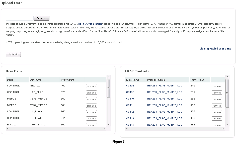
B. The integrated pipeline for user data analysis (described below) allows users to upload their data, score interactions, visualize results and build interaction networks. Interactions can be scored in several ways using two complementary criterion: enrichment and specificity. Empricial fold change scores (FC_A/FC_B) and SAINT (SP) use negative controls to compute the enrichment of a prey with respect to the background -- real interactions have a high enrichment score (see below). Interaction specificity score (IS) and CompPASS WD-like score (WD) estimate the specificity of a bait-prey interaction in a collection of pull-down experiments. Accordingly, IS and WD scores are applicable only to medium/big data sets, comprising several unrelated baits.